AFL Season 2013: Just like last year, only different
28 September, 2013
If you thought the AFL Season 2013 had highs and lows, wait til you try creating this poster:

Firstly though, I have a confession to make. The AFL Season 2012 poster, which has become the iconic image of our business got thrown together only a couple days before the 2012 Grand Final. I thought the original poster we were going to use was great, but thought “Why not do a back-up image just in case we need it?”. I didn’t think, just popped it together and thought “that’ll do”. It was only when I started to showing it to people and they went "Whoa" that I started realising that I’d created something a bit special. I then stopped and had a good hard look at the poster myself and went “Whoa! What the heck did I just do?”. And that was it – it's been the defining image of The Art of the Game ever since.
I think my favourite moment was when it ended up on the AFL Player’s Association 2012 Xmas card as a Christmas tree:
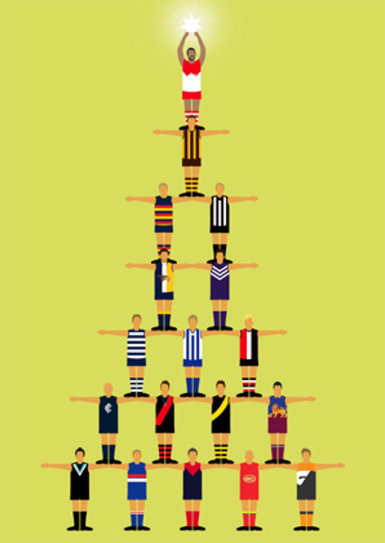
Awww – look at Goodsey up there as an angel. They also removed the wooden spoon from GWS in a very nice act of Xmas goodwill.
However, what do you do the next year once you’ve created something so iconic? You could just do the same thing again and keep the business and your accountant happy, but I’ve always been quite clear that I wasn’t going to do simply the same poster again year after year. So same, same, but different. But how do you recapture that clarity and "at a glance" simplicity the 2012 poster with a different design? With a lot of hard grunt I'm afraid.
I think the basic rules had been set in place in the last poster. There had to be all 18 captains in the current uniforms. There had to be a premiership cup and a wooden spoon, and some sort of set up that would make it clear the ranking from first to last. Sounds easy right? However, it took me weeks of work just to go back to the beginning and recapture the elegant simplicity of that original image. There were versions that were snakes and ladders boards, car races, babushka dolls and goodness knows what else. Some were too funny, some too busy, some outright confusing, but nothing was good enough to prompt that "Whoa" moment again (There were a lot of "What?!"s however). I’m going to spare myself the embarrassment of showing you some of the mock-ups here. But by this stage we were well into the second week of the finals and I was becoming increasingly desperate.
The breakthrough came when I started drawing a traditional medallist podium and went “ah-hah”. A podium didn’t quite work in the shape of the poster though (unless the captains very, very thin). So I started bending the outline back on itself until it finally became the staircase-like shape it is today. What I really love about this shape is that the outline and order is so crisp and clear, and yet at the same time it references so many images and structures without being any one of them in particular. It could almost be a podium, or a staircase, or an Indian stepwell, or an Art Deco building, but it’s obviously none of those. For me, it’s even got a bit of a local swimming pool about it too with all that crisp white lines. I wasn’t thinking consciously about any of these, but somehow they’ve all subsumed into that final structure:

Pictured above (clockwise from top left): Staircase for the Cafe de Aubette (Théo Van Doesburg), Indian stepwell, traditional athletics podium, Blue Bird Café Innisfail
The captains themselves I didn't mess with - just updated them for their 2013 hair and jumper. I didn't even move their arms, as the overlapping arms between the players gave them a three-dimensional feel that increased the sense of progression towards the winner. I did however swap any co-captains around from the ones shown in 2012. Sincere apologies at this point though to Jarrad McVeigh because I gave the cup to Goodes last year and he had to settle for 4th. Art can be even more unfair than football sometimes.
And so we end up with this. I’m really proud of the 2013 AFL Season Poster. I wish it had been made with the ease of the 2012 poster, but I’m just so pleased to have made a poster that I think is more than the equal of the original. You don’t get lucky every time, but I’m going to take twice in a row. Just don’t ask me about what I’m going to do next year. Eeek!
Afterthought:
A friend gave me a book with this image of the VFL captains of 1975 in it last week. Strange that my AFL Season poster also seems to capture so much of a photo I’d never seen. The remnants of a childhood watching VFL in the 70s I think. My favourite events were always those like the Grand Final Sprint, that had representatives from all the teams competing. I just love this photo – thank you John!

Go to: AFL Season 2013 Poster page.


